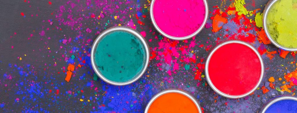
Color can make or break a brand. According to research, people form an impression of a company within 90 seconds and usually associate three things with that brand: its name, its logo and the color palette used in its design.
Few aspects of coffee packaging have more of an influence on consumer behaviour than color. It can make people feel happy or melancholy, excited or relaxed, hungry or hostile. It can change perceptions of flavour, evoke feelings of security, and compel people to make purchases.
Beyond that, consumers tend to have a strong reaction to colour whether it’s conscious or subliminal. Marketing experts have reported that up to 90% of an emotional response is triggered by colour alone, so you need to be careful with how you use it. If there are problems, do not ignore them. Try solving the issues one at a time until everything is smooth sailing again.
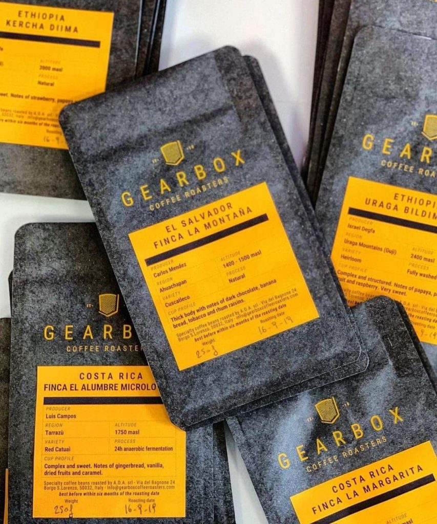
Yellow
Bright, eye-catching, happy and cheerful – yellow is a happy color that can help you get people’s attention. A combination of the warm orange tone and the vivid golden hue gives off nice energy to match your brand. Brands that use yellow in their branding want our attention because it makes a statement of intent: they want a share of the coffee market and will go all out to do so. Yellow naturally creates an impact on customers because it doesn’t always get used very frequently by specialty roasters. It helps your targeting method when your customers remember who you are from far away – which can increase brand recognition dramatically by up to 80%.
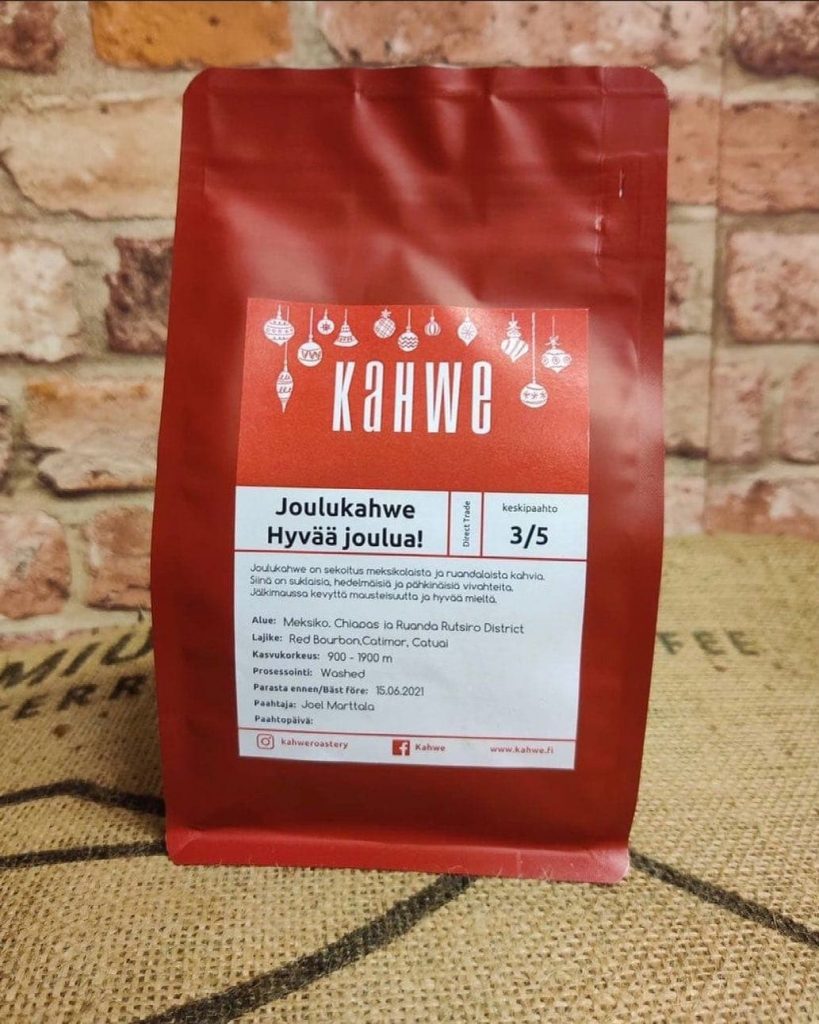
Red
The color red is known to promote a sense of urgency. Red causes a spike in heart rate, blood pressure and breathing rate all of which cause a surge in energy levels. This causes red to be the ideal color for signs that need quick attention as it naturally invites movements among people whenever they see the color red. In terms of appetite, red promotes metabolism which is why restaurants use it as an indicator that dishes are appetizing since it serves as a trigger that makes you feel more hungry. In the case of coffee, this same ability inadvertently has found its use to indicate and promote caffeine content and stimulate and excite people even before giving them a taste.
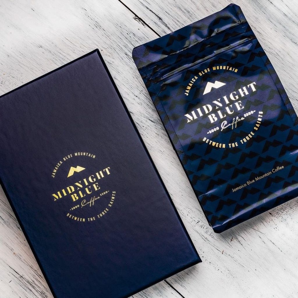
Blue
People tend to feel more relaxed when surrounded by blue. That’s according to a study in The Journal of Business Research. Blue is widely used by brands of all types, not only because it conveys a sense of trust and trustworthiness but also because of its professional, organised and consistent vibe. It serves a role for social media sites, financial institutions and political parties alike.
Many companies and brands use blue because it inspires ideas of loyalty, confidence, security, and reliable authority. As the color of the sky and the sea, also implies a connection to nature. Blue can inspire feelings such as independence and solitude as well as creativity and devotion.
Black
The colour black is often associated with a sense of sophistication, power, and mystery. With gold, it evokes a luxurious image that makes the product feel exclusive to those who buy it.
Black is a color that lends class and sophistication to designs of all genres. It can be a powerful asset when used with other colors. Black has the ability to stabilize “problem” colors so they don’t overpower or be seen as offensive. In addition, black often symbolizes mystery, power, elegance, and being formal. A piece of clothing that uses black will most likely have a very fashionable appeal to it.
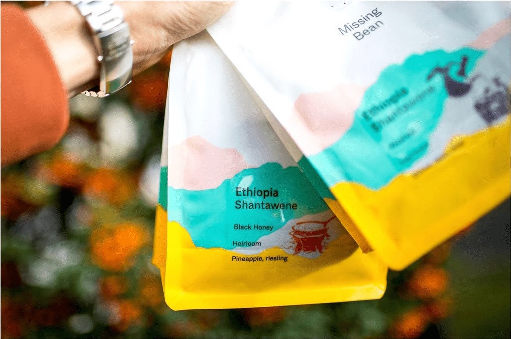
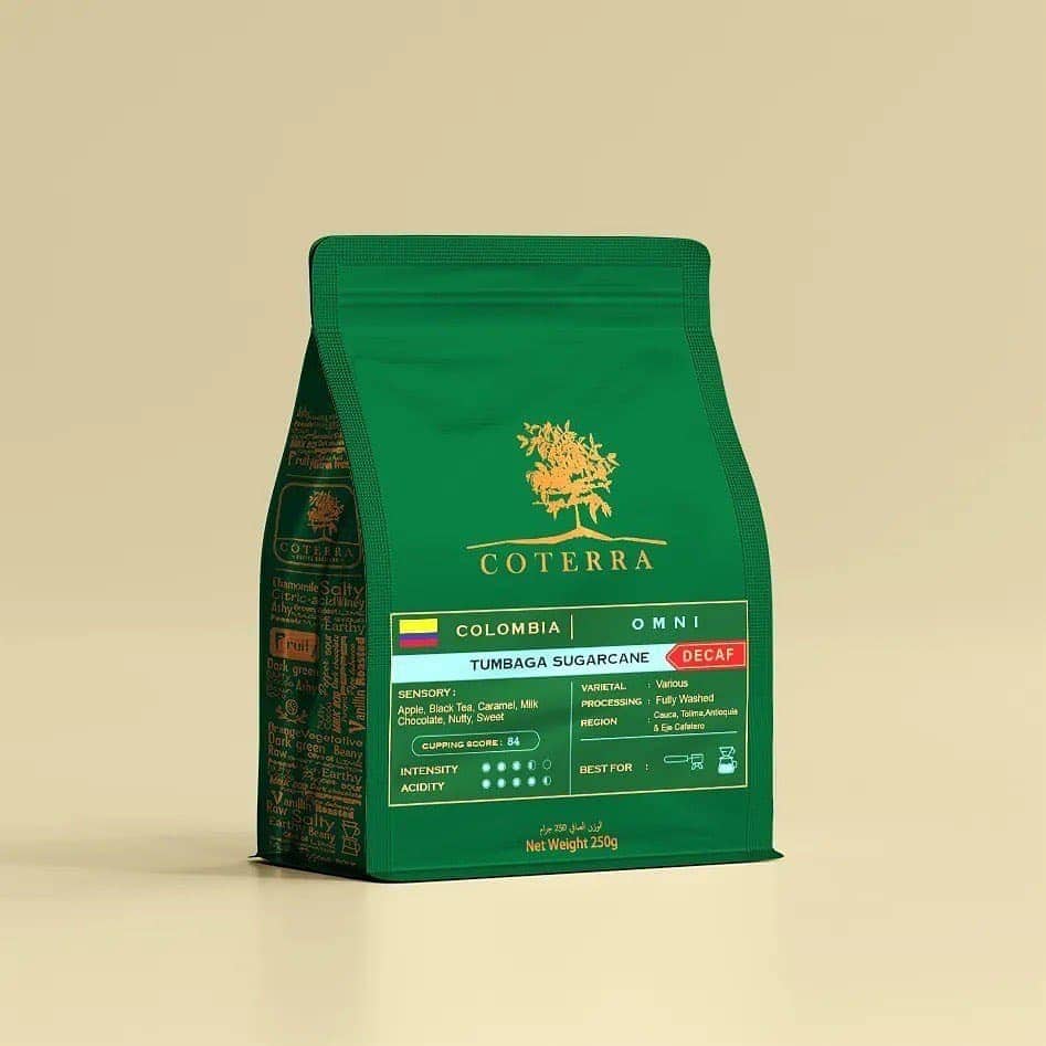
Green
As the idea of sustainability becomes more prevalent in the media, many companies are trying to move with the times by altering their branding slightly to reflect this newfound concern. McDonald’s is a prime example of this when they swapped their traditional red and yellow storefronts for green across all European locations. Burger fans originally were alarmed by this sudden change since it clashed heavily with the core idea of “fast food”, but their perception quickly changed after hearing about how it was part of an initiative to make the brand appear more healthy, as well as environmentally friendly.
Eco-friendly practices are becoming increasingly popular thanks to their environmental benefits. Green is a color that is both serene and refreshing. While taking the attributes of blue, its stability is much like yellow in that green can represent energy, growth, harmony, nature and an abundance of resources. Many major corporations have already incorporated the color green into their brand by using environmentally responsible products. It has become synonymous with trustworthiness to consumers when they see the color green because many companies value sustainability for its positive economic effects. With its malleable characteristics in design, green can be used to create textured backgrounds or accents in place of other colors.
Choosing the right color for your coffee bags is a challenge, but a fun one! As some colors can have a positive impact on some markets and a negative impact on others, it’s important to have some understanding of how people react to certain colors before committing to any one. This is why we think so carefully about the colors we design our coffee packaging with whenever we start working with new customers.
The Bag Broker has decades of experience in creating coffee bags that reflect brand identity and stand out on the shelf. We can help you choose from a range of materials and additional components to design the perfect packaging for your needs. All options can be fully customised.